
How do you design digitally accessible and aesthetically pleasing?
Many of the projects we do at Unc Inc require a high level of digital accessibility. That means that in our work we pay a lot of attention to making our digital products "barrier-free" so that everyone, including people with disabilities, can use them. But why should you actually consider this important? And as a designer, how can you comply with the guidelines without compromising aesthetics? In this article, product designer Semih Yilmaz breaks a lance for "inclusive design" and hopes to inspire you with some examples to design that is not only accessible, but also beautiful.
The importance of designing for accessibility (goes much further)
As a responsible designer, you should always be mindful of the impact of your (digital) product on the people who use it. Making sure everyone can make full use of it, regardless of their skill, situation or context, is an important part of that. But beyond the moral consideration, there is also an important commercial gain to be made, something that my colleague Boaz already touched on in his blog about WCAG: 4 easy tips to make your website more digitally accessible. For starters, not only will you make your website more accessible for people with disabilities, you will also improve speed and usability for all users. But the biggest commercial advantage is that by optimizing for accessibility you also optimize for indexing by search engines, for SEO! By making your online services accessible to the 20% with functional limitations, you will be better found and used by 100% of your target audience. (Read more about The Business Case for Digital Accessibility.)
An important tool for our work are the Web Content Accessibility Guidelines (WCAG 2.0). However, sometimes they can be discouraging and the guidelines seem to limit your creativity in particular. But we prefer to see them as a challenge because we are convinced that accessibility need not come at the expense of good design or innovation. So instead of limiting ourselves, we try to go a step further by using our sense of aesthetics to make our products not only accessible but also beautiful.
Hoping to inspire you with this, check below some examples of how we meet this challenge.
Our vision and approach as designers
At Unc Inc, we see accessibility as part of a much broader issue that - rightly - gets a lot of attention: inclusivity. For that reason, we also don't limit ourselves to making our products accessible and usable for people with functional disabilities. We also look at the elderly, people with socioeconomic disadvantages, even people with poor Internet access (see, for example, our work on the International Centers of Excellence on leprosy and neglected tropical diseases). We even developed a mobile app that let you experience for yourself what it's like to have a disability. In this case from the Participation Clinic for educational purposes to let nurses in their nursing homes experience what it's like to have dementia.
1. Use sufficient color contrast
According to the World Health Organization (WHO), there are 200 million people with visual impairments. Since many of them have difficulty reading online text, ensuring adequate contrast between the color of the text and the background is a simple way to help the visually impaired.
My favorite tool for checking color contrast in my designs is Stark, a plugin for Figma, Sketch and Adobe XD. By selecting two layers, you can easily check if the color contrast between them is sufficient. If not, the tool immediately suggests ways to improve it. Easy and fast!
2. Use visual cues to make information more understandable
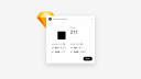
People who are color-blind or have low visual acuity will have trouble understanding your content if you only (or mainly) use color to communicate something important, show an action or solicit a response. The best way to engage these people in your design is to combine color with an additional indicator such as a pattern, label or movement.
For example, if you want to communicate an error, don't rely solely on colored text. Add an icon to give it more context. If you create more complex elements like tables and graphs, they will be more difficult to understand if you only use color to distinguish data. My advice would be to use additional visual aspects to communicate information. Think shapes, labels and varied dimensions. You can also try using patterns in your fill colors to make differences more visible.
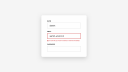
3. Add labels to fields in forms
Using "placeholder text" as labels is one of the biggest mistakes made in form design. Nevertheless, it has become quite popular; a trend that is sometimes tempting for me to capitalize on as well. However, placeholder text is normally gray and has low contrast, making it difficult to read. So better to let this trend pass you by.
Since people can sometimes forget what they were typing, it also doesn't help that the labels are then gone. Make sure that people understand what to do and write in a form at all times. When designers hide descriptions or prompts in their forms , they sacrifice usability for simplicity.

When I design forms, I make sure each input field has a label above it, a placeholder if possible, with a distinctive colored line around it. And because people are used to reading from top to bottom, I always "stack" elements of a form like input fields, radio buttons, checkboxes and selectors vertically.
4. Stick to semantics in your content structure
'Headers' (headers) establish the hierarchy of content on a page. They give the reader an indication of where the content begins and what its function is. Titles of different font sizes help to understand the order of the content.
For example, the top-level header (h1 tag) should be larger than the lower-level header (h2 tag). And the h2 header in turn should be larger than h3, and so on. The idea will be clear.
A clear hierarchy of headers helps the reader understand the content and tells the browser what content the page contains and how it should be rendered or handled. In addition, it allows "screen readers" - used by blind people to "listen" to a page - to read the content in the correct order. (Read more about semantic structure by WebAIM.)
5. Design your focus states
Browser by default show an outline of elements that are selected, called focus indicators. If you are like me, you probably find the default focus indicators ugly and will be tempted to hide them. Should you indeed remove the default style, be sure to replace it with something else. Otherwise, you will exclude people who use the aforementioned screen readers, and people with limited mobility or "power users" who use their keyboard as their primary means of navigating the Web.
The elements that need a focus state are text links, form fields, buttons and menu links. With a focus indicator, you simply make them look different from surrounding elements. It's okay to design a focus indicator with your brand colors. Just make sure that "state" is clearly visible and has enough contrast to stand out from surrounding elements. (Deepen your understanding of accessible focus states via W3C Focus Visible.)
Bonus tips ?
With the holidays approaching, we want to gift you some additional tips that we think are almost as important.
Incorporate accessibility into your work process
If you're designing or researching, verify your assumptions about accessibility and take every opportunity to improve yourself.
Have an audit done on accessibility
Use an audit service to determine if your product works with assistive technologies and meets the minimum requirements from the WCAG 2.0 AA. Use the results of the audit to fix any issues and do another test to see if you've succeeded.
Add alternative text to your images
It's not necessarily up to the designer but if you want to do more to increase the accessibility of your product, describe in the attribute of the image what can be seen and how it matters to the message.
Conclusion
You made it!!! You just read my five tips to help you make your designs more inclusive and equally appealing.
At Unc Inc, we continue to explore how to make accessibility even more a part of our design process. But for myself as well, it's something I want to continue to improve in. As I explained at the beginning of this blog, it pays off for many reasons. That's why I encourage you and everyone else to delve further into the guidelines, incorporate them into your work process and thus contribute to an accessible and inclusive web. Let's all strive to develop technology that is usable and available to all people regardless of ability, economic situation, age, education or location by adding accountability to our design skills.