
Design System for HVC
A Design System helps establish a central system for developing a consistent and engaging user experience across different digital applications. It allows us to create reusable components that we can deploy in different environments such as websites and apps.
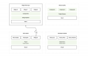
We design and develop several applications for HVC, including the main website, a "working at" platform, some campaign websites, some self-help tools, and, of course, the HVC app. In addition, HVC itself and some of HVC's suppliers also develop applications.
To ensure consistency in these applications, we work using a Design System. This Design System includes guidelines for, among other things, house style elements (fonts, colors, margins, etc.), as well as the design and interaction of interface elements (buttons, form elements, menus, etc.). These guidelines ensure that all different applications have a consistent and attractive look and feel.
Optimization of design consistency
The various applications use a variety of languages, frameworks, etc. Among others, we use Drupal (with Twig), React, Vue, etc. For these tools, we have developed a number of components and, using the Design System, ensured that, provided a certain structure is met, these components are presented consistently.
Some of the applications are embedded as separate tools on the website, or are part of a multisite solution, such as the HVC News Square. Thus, because the styling is provided from the website theme, these tools do not need to load their own styling; they inherit it automatically from the website.
However, there are several individual websites, including Working at HVC and the campaign websites. These run as completely separate websites, and all contain their own implementation of the Design System. Not necessarily intentional, but this is how it once grew.
The main disadvantage of this approach is that there is a chance of inconsistency in the implementation of the different Design Systems, and a change means that the change has to be made in different places. In addition, there is no central showcase where the Design System is properly implemented. So it is time for a different approach.
Towards a centralized design ecosystem
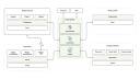
Despite the different techniques used for different applications, they all have one common feature: they are Web-based applications. Therefore, we can at least reuse the styling.
Furthermore, all projects use NPM for dependency management. So it was obvious to publish the Design System as an NPM "package" and load it into the various applications.
This NPM package consists of three parts:
- All styling source files (SASS),
- Various React components,
- An implementation of Storybook, tests and documentation.
The styling source files include the design of all components and can be applied individually per component. This way we use only what we need and avoid overly large CSS files. Applications that do not use React components (such as Drupal) can load this styling and only need to provide the correct HTML structure to apply the correct styling.
The React components can be used directly in all React applications, such as the widgets and Working at HVC. These components load the corresponding CSS themselves.
The Storybook implementation documents all components and makes them available in a clear overview. After each update, these are automatically deployed to an online environment. Automatic tests are performed prior to each deploy to prevent regression, among other things.
The whole is deployed as an NPM package when a new version is tagged. This can then be updated across all applications.
Advantages
- Central location of code and tests: By managing the Design System as a central NPM package, we have a single source of truth for all code and tests. This leads to significantly less duplication of code and tests within our projects.
- Consistency across all different applications: Using the Design System ensures a uniform and consistent user experience across all applications. This reinforces HVC's brand identity and improves the user experience for end users.
- Assurance of correct operation through automatic testing: Thanks to the automatic tests performed as part of the deployment pipeline, we have assurance that all components are functioning correctly and that any changes do not have unintended side effects.
- Modifications to components only need to be done once: Because all components are managed within the Design System, modifications or enhancements only need to be made in one place. These changes are automatically implemented in all applications that use the Design System.
- All components become fully reusable: The components developed as part of the Design System are not only reusable within all of our applications, but can also be used by HVC and their suppliers. This promotes efficiency and collaboration within HVC's ecosystem.
Follow-up steps
- Migrate all remaining components, such as those from Drupal: We will migrate the remaining components, such as those from Drupal, to the Design System to ensure full consistency and reusability. We may also be able to centralize the Twig templates.
- Document all components in Storybook: To facilitate component usage and improve collaboration, we will thoroughly document all components in Storybook. This will provide a clear and accessible way to explore and understand the components.
- Drupal themes use the components (Webcomponents?): We will explore how to adapt Drupal themes to make use of the components from the Design System. This could possibly be accomplished by implementing Webcomponents or other appropriate technologies to achieve seamless integration.